


Bobby Communications
Bobby
Communications
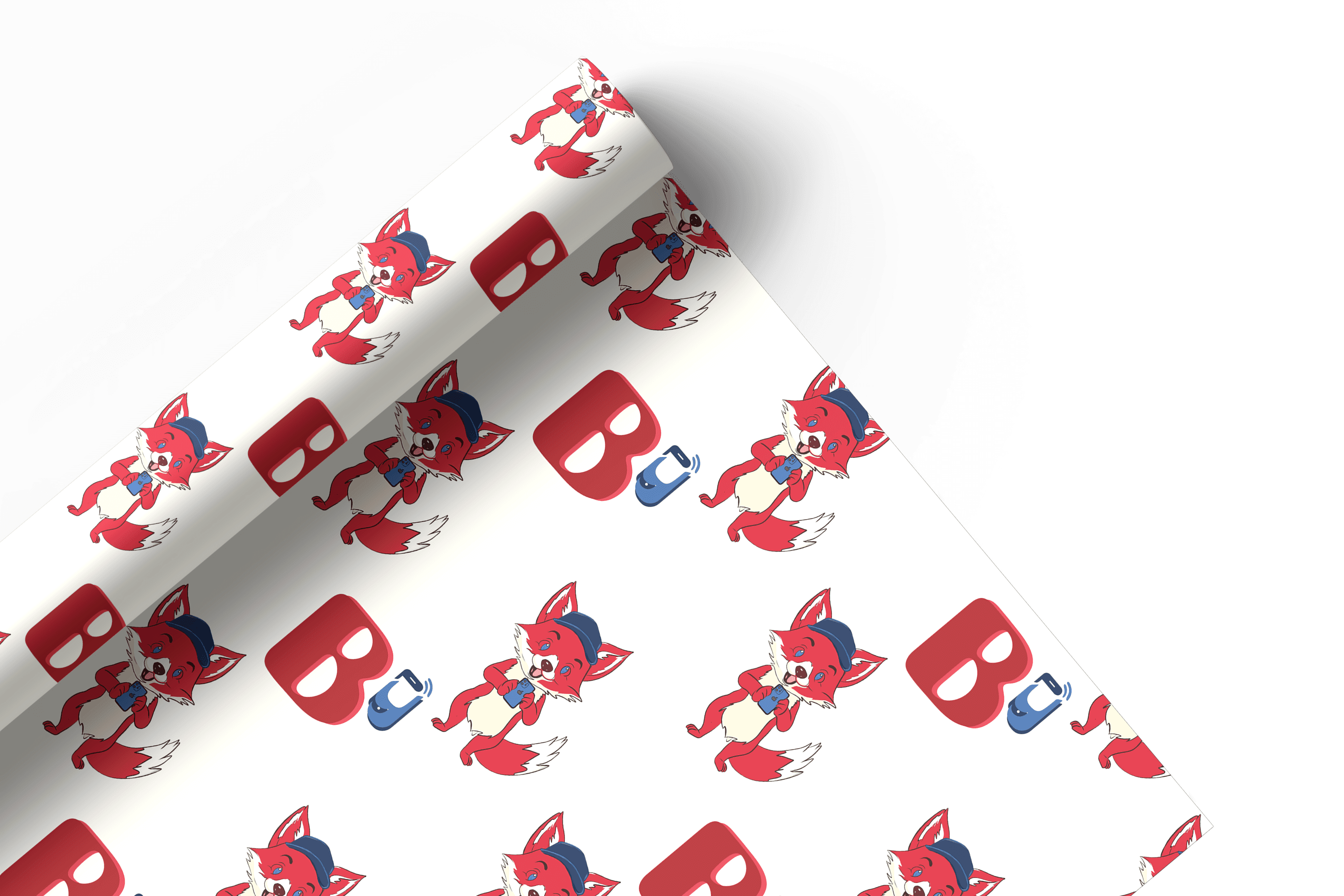
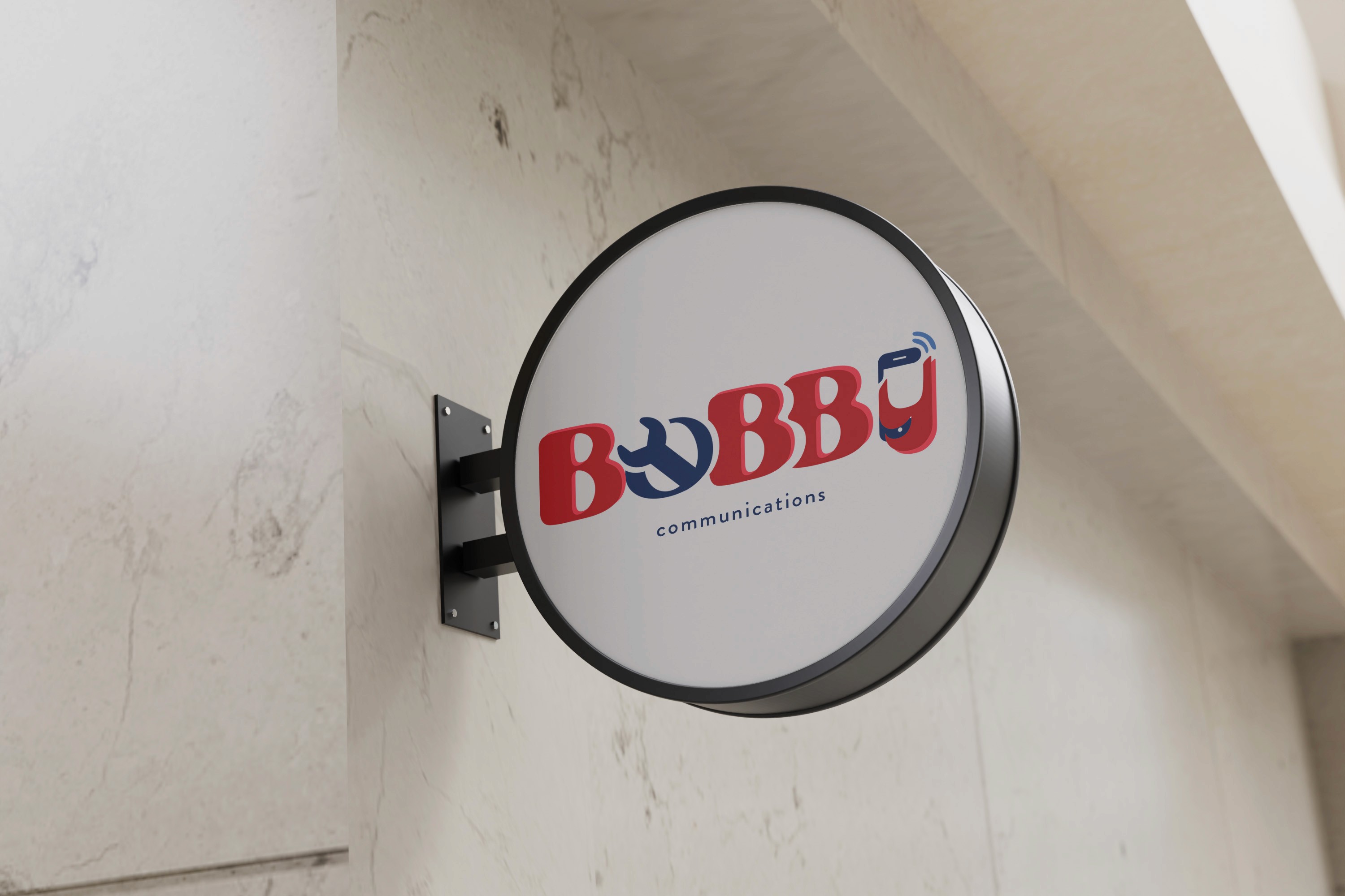
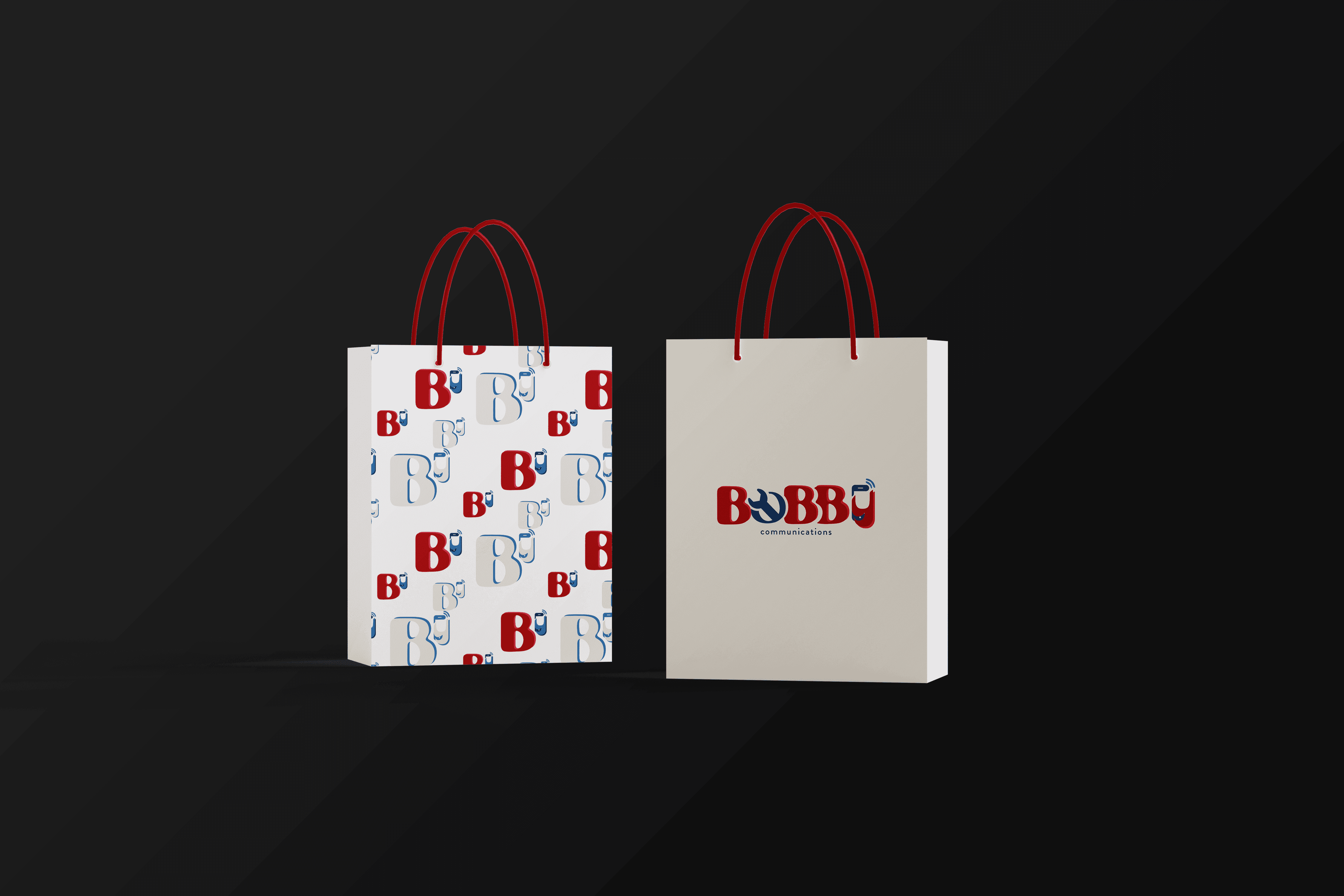
The logo design features a creative typographic approach, incorporating custom elements that reflect the brand’s innovative and tech-savvy nature.
The logo design features a creative typographic approach, incorporating custom elements that reflect the brand’s innovative and tech-savvy nature.
The logo design features a creative typographic approach, incorporating custom elements that reflect the brand’s innovative and tech-savvy nature.
The letter “O” integrates a wrench, symbolizing reliability and problem-solving, while the “Y” creatively represents a smiling communication device, reinforcing the brand’s focus on connectivity and user engagement.
The color scheme utilizes a strong red and blue combination, conveying trust, energy, and modernity. The visual identity was applied to signage, ensuring high visibility and a professional yet approachable look for the brand..


Bobby
Communications
The letter “O” integrates a wrench, symbolizing reliability and problem-solving, while the “Y” creatively represents a smiling communication device, reinforcing the brand’s focus on connectivity and user engagement.
The color scheme utilizes a strong red and blue combination, conveying trust, energy, and modernity. The visual identity was applied to signage, ensuring high visibility and a professional yet approachable look for the brand..